VAULTIX: REBUILDING TRUST IN FINTECH
A product that worked technically but lost users on trust. How a focused reset improved activation, retention, and unit economics.
The Baseline We Had to Rebuild From
The failure wasn't technical, it was the relationship between the product and the user.
Vaultix launched a solid, bank-grade platform. Every core system worked. But users quit before they ever got any value from it. The problem wasn't the code. It was trust, too many choices, and too much to take in at once.
Onboarding Collapse
65% of new users dropped off before finishing setup. Compliance steps came first, so people felt interrogated before they felt welcomed.
Feature Paralysis
The app launched with every feature showing at once, spread across too many pages. Users couldn't tell where to start, so most never did.
Retention Crisis
About 25% 7-day retention meant three of every four new accounts quietly left in the first week, wasting the money spent to bring them in.
Unsustainable Economics
At a 0.8:1 CLV to CAC ratio, each new user cost more to acquire than they brought in. The company was growing its losses, not its business.
End-to-End Ownership of the Turnaround
As Director, User Experience & Product Design, I led the reset across research, product vision, prioritization, experience design, and business alignment. The goal was to make design move the business numbers, not just polish the screens.
Research Synthesis
Turned user interviews and behavioral analytics into one clear, shared picture of why users left.
Product Vision
Partnered directly with the CTO and engineering leadership to align technical capability with a focused user narrative.
Strategic Prioritization
Owned the harder decision: what not to ship. Cut scope to protect the first-session experience.
Experience Design
Redesigned onboarding, the home screen, and the core action loop around one simple first-session flow.
Business Alignment
Tied every design decision to onboarding completion, 7-day retention, and CLV/CAC recovery.
Stakeholder Defense
Presented and defended the strategy to executive, engineering, compliance, and investor audiences.
Three Trade-Offs That Reset the Product
Breadth vs. Focus
Concentrated design and engineering behind one effortless flow so users experienced core value before ever encountering complexity.
Visible vs. Felt Security
Trust came from calm, confident interactions, not from piling on security steps that made the app feel fragile.
Data Richness vs. Cognitive Load
Replaced dense walls of data with a few clear moments tied to what the user wanted to do next.
From Explaining Security to Earning Trust
The redesign came down to one rule: every interaction should either deliver value or quietly build trust. Nothing else made it into the first session.
Trust By Interaction
Confidence came from small moments, tone, motion, and clear confirmations, not pop-ups or disclaimers.
Invisible Security
Biometrics, device trust, and step-by-step verification replaced the upfront compliance wall, without weakening compliance.
One Clear Next Action
Every screen had one main action tied to the core use case, ending the confusion of the original cluttered layout.
From Market Research to Product Plan
Four connected pieces of work that took Vaultix from a crowded, feature-heavy market to a focused, trust-first product.
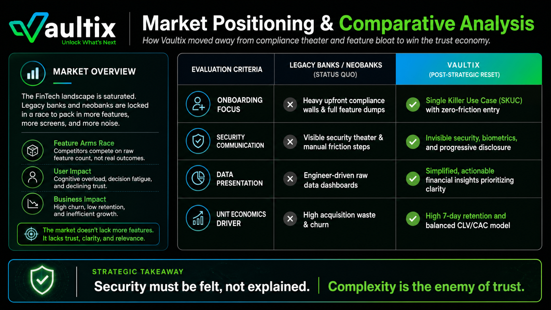
Market Positioning & Comparative Analysis
Legacy banks and neobanks compete on how many features they have. Vaultix went the other way, replacing upfront compliance walls and raw data dashboards with one simple first-session flow and security that works in the background.
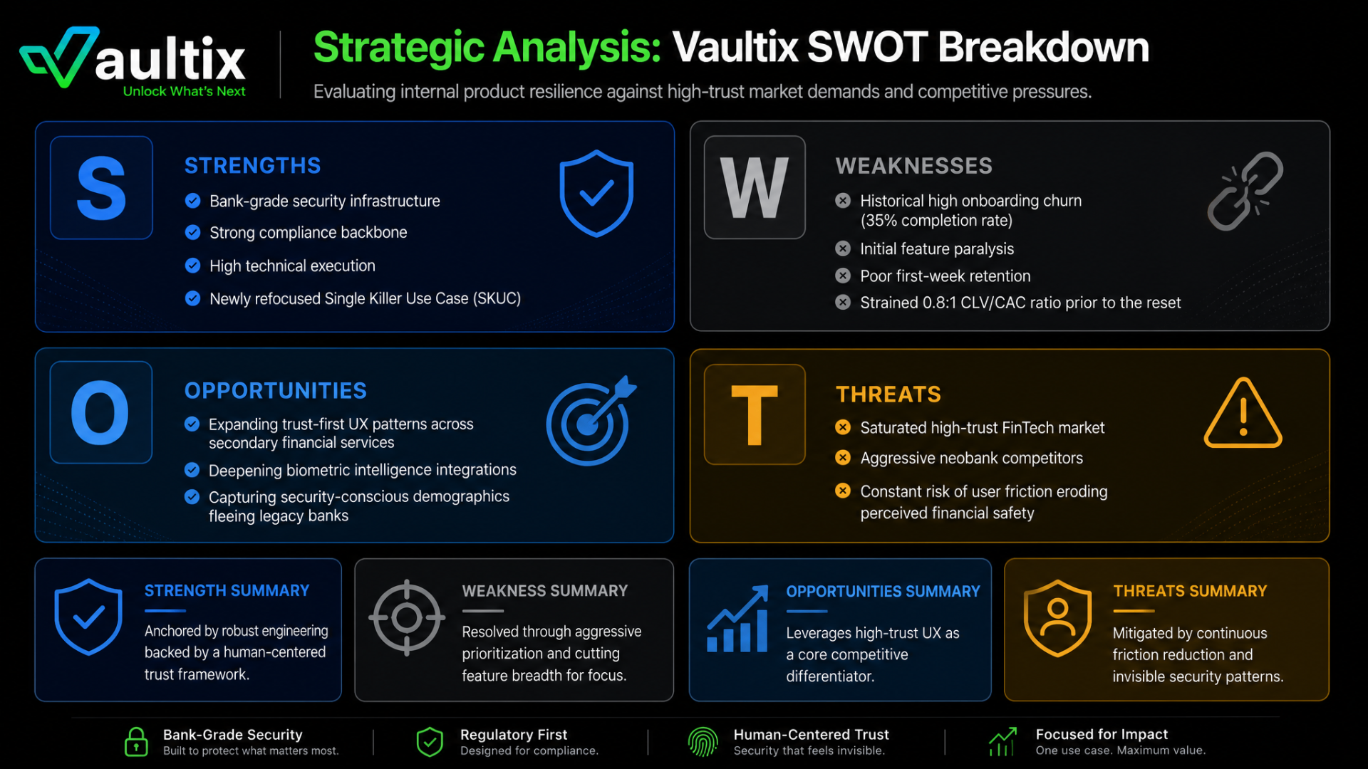
Strategic Positioning · SWOT Matrix
A SWOT breakdown showing where Vaultix's bank-grade infrastructure was a strength, and where onboarding drop-off and poor unit economics were pulling it down.
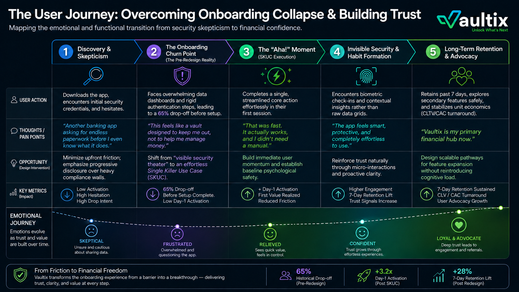
The Human Experience · User Journey Map
Five stages, from first doubt to loyal user. The map shows exactly where users quit before the redesign, and the moment the first-session flow turned hesitation into confidence.
System Architecture · Product Mind Map
Four areas of the product, rebuilt around clarity and quiet security, each tied to a business result.
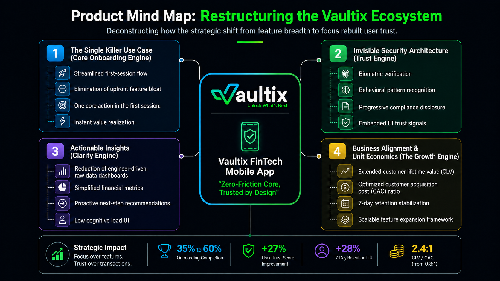
From rough wireframes to a simple, trusted mobile app.
Two design phases. The clarity we found in low-fidelity wireframes carried into a polished interface where security is felt, not explained.
Low-Fidelity Wireframes & Architecture
The lo-fi phase was about cutting the clutter: stripping out extra features, simplifying navigation, and proving the core action in as few screens as possible. Onboarding was rebuilt so verification, preferences, and legal agreements showed up when they were actually needed, not all at once on the first screen.
Cut the Clutter
Removed extra entry points, duplicate tabs, and secondary buttons that competed with the core action on first launch.
Progressive Disclosure
Onboarding showed only what was needed to reach first value. Verification and preferences moved to the moments when they were needed.
One Primary Action
Every wireframe was tested against a single question, what is the one thing this screen must make effortless.
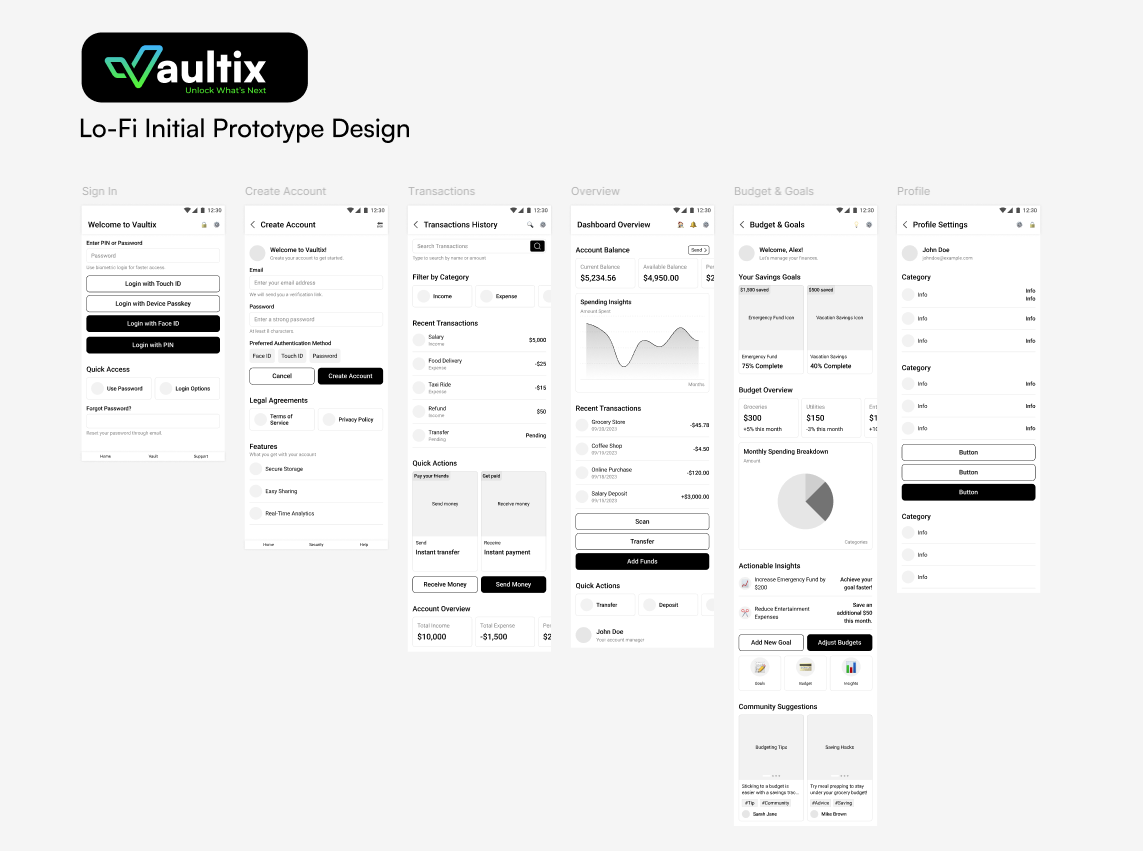
Initial Structural Pass
Baseline wireframes establishing navigation model, screen inventory, and the Single Killer Use Case surface area.
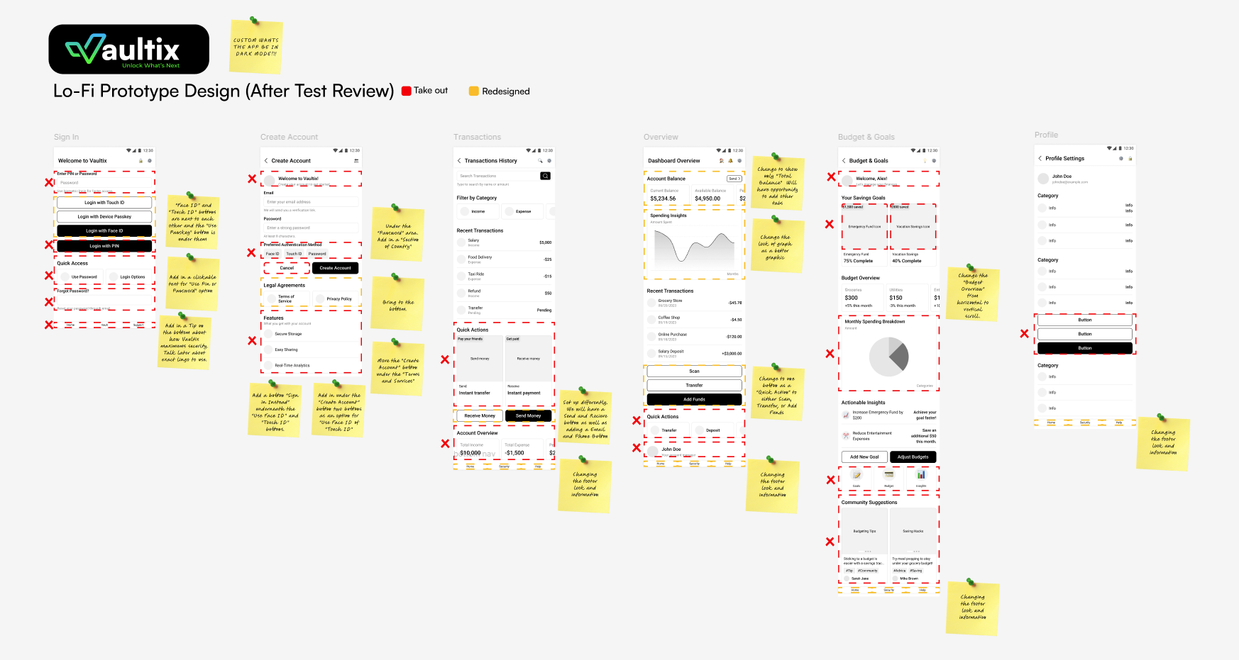
Post Usability Review
Annotated redlines from moderated testing with 18 people, showing what was cut, what was redesigned, and where dark mode came in.
High-Fidelity Interactive UI
The hi-fi design carried the lo-fi focus into a dark-mode interface. Biometrics, quiet security cues, and simple insights replaced the old data walls, and every component was built to earn trust through tone, motion, and clear confirmations instead of disclaimer text.
Invisible Security
Face ID, Touch ID, and device passkeys elevated as the primary path.
Actionable Insights
Spending, goals, and budgets condensed to next-best-action cards.
Premium Dark Mode
Deep charcoal surfaces, restrained teal accents, and elevated typography.
Component States
Buttons, inputs, and status cues designed for confidence at every tap.
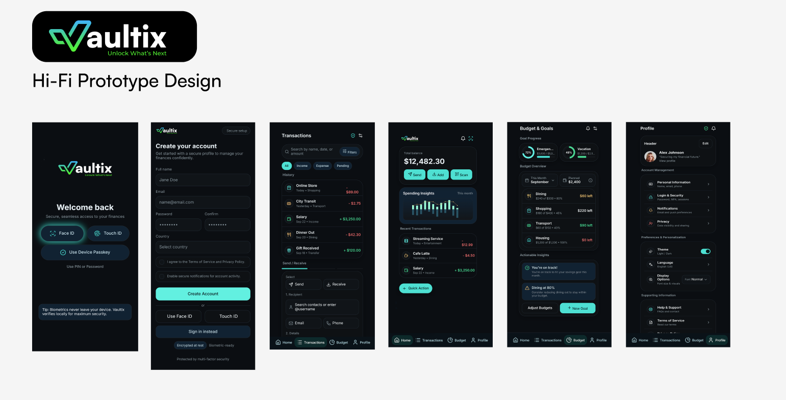
Hi-Fi Interactive Prototype
The shipped visual language, tuned end-to-end for trust, speed, and a single clear next action across every core surface.
Marketing & Brand Ecosystem
Positioning Vaultix through a secure, modern visual identity and targeted marketing touchpoints.
Brand Strategy & Positioning, "Unlock What's Next"
We repositioned Vaultix away from cold compliance and security theater, and toward a story of empowered financial confidence. The new promise, "Unlock What's Next," reframed security as a springboard for growth rather than a gate to endure.
We gave every team the same story to work from. Presentation decks, office displays, and stakeholder materials kept product, engineering, marketing, and leadership aligned on one message and one look.
- ›Confidence over compliance, growth over gatekeeping.
- ›One story across product, brand, and marketing.
- ›Shared decks and displays that kept every team on the same page.

Marketing Touchpoints & Acquisition Alignment
Marketing assets were streamlined around a single, honest promise so first impressions across ads, app store, and web all reinforced the same trust-first product experience.
Pulling everything into one brand system made sure the ads matched what the product actually delivered. Together with the product redesign, that helped cut CAC by 31% and lift the CLV to CAC ratio from 0.8:1 to 2.4:1.
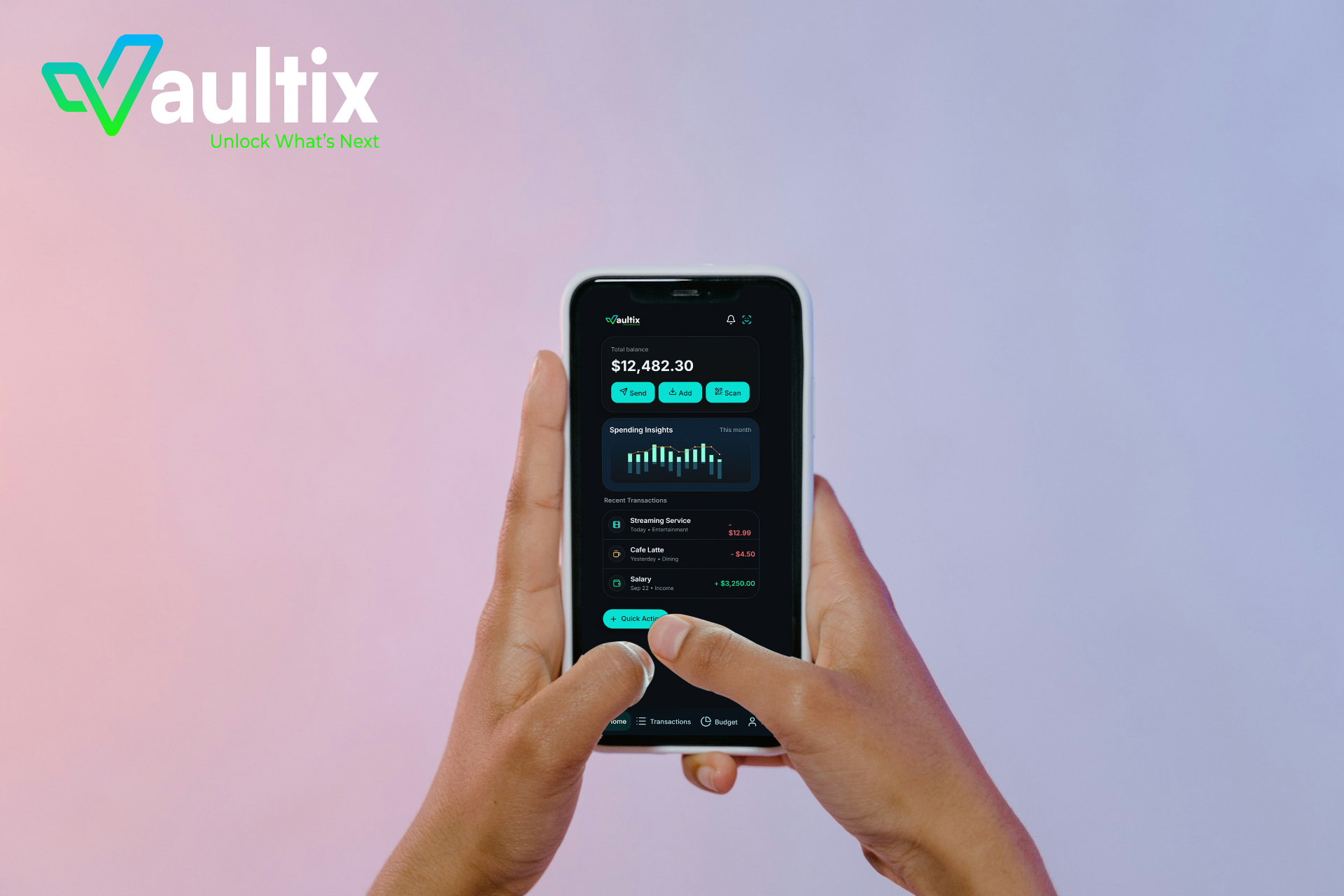
Brand Identity & Design System
A modern, confident brand built around trust and forward momentum.
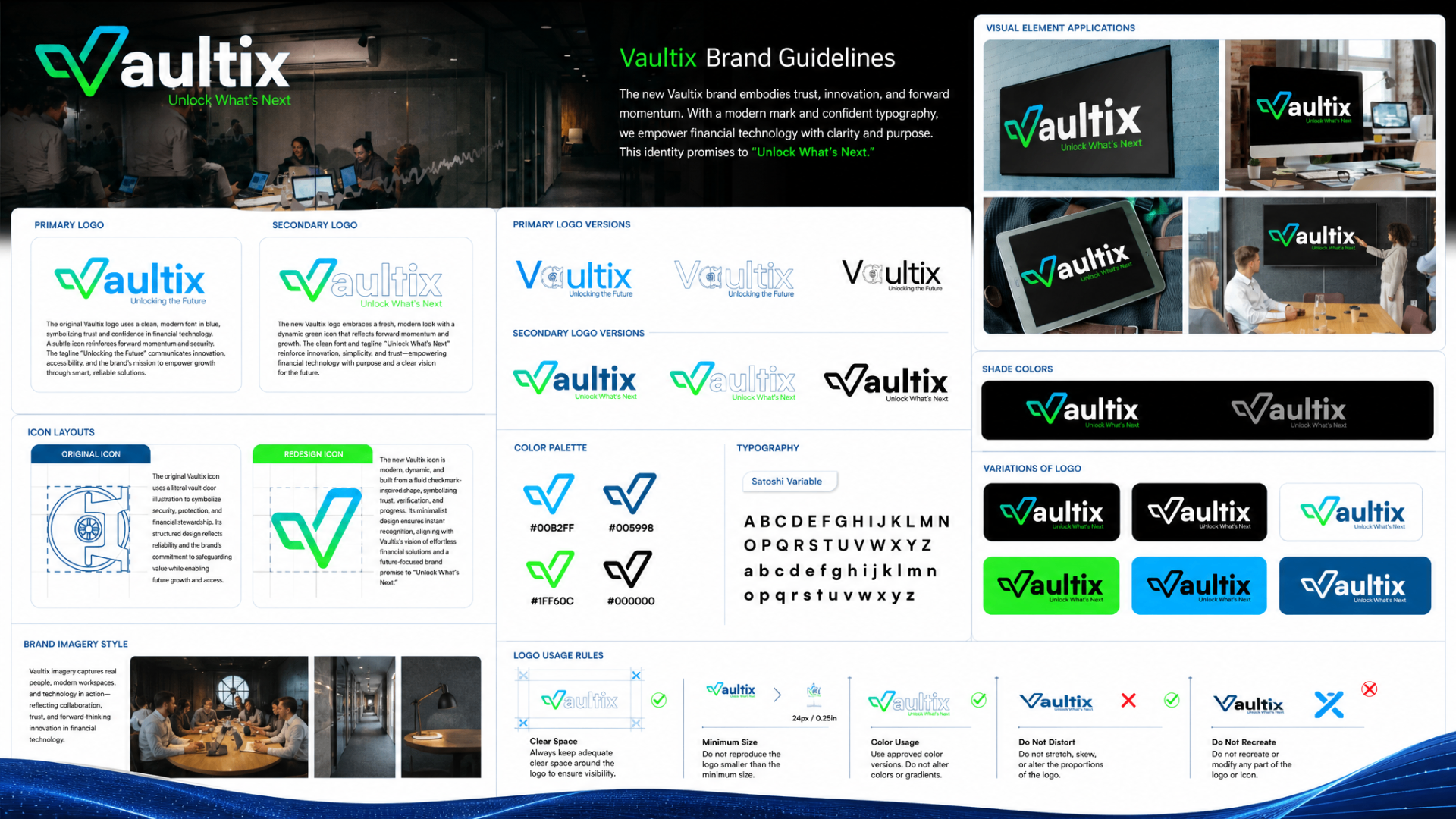
Logo Evolution & Architecture
We moved Vaultix from a literal vault door, a symbol of lockdown and friction, to a dynamic checkmark-inspired mark that signals verification, momentum, and forward progress. The refreshed wordmark pairs with the promise, "Unlock What's Next."
Locked, Static, Defensive
The original icon leaned on a literal safe metaphor, communicating security through weight and structure, but also implying friction, rigidity, and gatekeeping.
Verified, Fluid, Forward
A checkmark-derived form signals confirmation and momentum. Paired with a clean wordmark and the tagline "Unlock What's Next," it reframes security as progress.
Color Palette & Typography
A dual-tone system, vibrant green for progress and momentum, deep blue for stability and trust, anchored by monochrome neutrals for clarity across every surface.
A modern variable sans tuned for financial clarity, sharp headers, calm body copy, and tabular numerics.
Shade Variations & Logo Usage Rules
Guardrails that keep the identity consistent across every product surface, marketing asset, and partner channel.


Clear Space
Always maintain adequate clear space around the mark to preserve visibility.
Minimum Size
Never reproduce the logo below 24px or 0.25in to protect legibility.
Do Not Distort
Never stretch, skew, or alter the proportions of the mark.
Do Not Recreate
Never modify or reconstruct any part of the logo or icon.
What Changed
The Questions Leadership Asked
Real questions from leadership, engineering, and investors during the Vaultix turnaround, and how we answered them.
Our research showed the opposite. Too many features was our biggest problem. Users weren't missing anything. They were overwhelmed before they ever saw what the app could do. By focusing on one easy first session, we went after the 65% onboarding drop-off and built enough momentum to bring other features back in later, safely.