Client details withheld to protect confidentiality. Metrics come from user testing with 12 parents and 15 kids.
KIDS VIEW: A LEARNING APP BUILT FOR KIDS AND PARENTS
How designing for two very different users, a child and a parent, shaped a safe learning app that tested well with both.
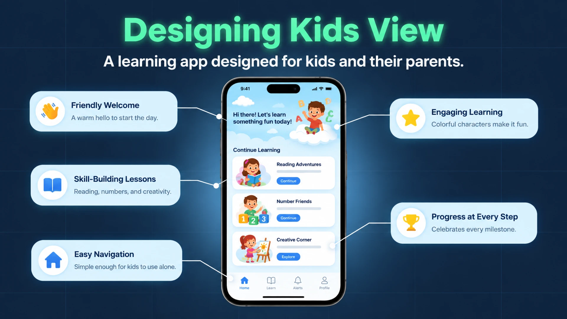
A learning app for kids ages 4 to 9 and their parents. Kids get big, friendly, easy-to-tap screens with characters instead of text. Parents get a clear dashboard showing progress and screen time. We designed it, built it, and tested it with 12 parents and 15 kids.
- Role
- Principal Product & Interaction Designer
- Team
- 8 designers and 5 developers
- Scope
- New iOS and Android app, built from scratch
- Target Audience
- Children (ages 4 to 9) and their parents
- Primary Outcome
- Kid-friendly app with COPPA parent gates, tested with 12 parents and 15 kids
My Role: Making It Fun for Kids and Clear for Parents
I led the UX strategy, interaction design, parent dashboard, and branding, with a team of 8 designers and 5 developers. The hardest part was designing for two very different people. Kids needed playful, forgiving screens where a wrong tap never felt like failure. Parents needed a clean, honest view of how their child was progressing.
We focused on ages 4 to 9 because our research pointed to it as a key window for early learning.
Designing for Kids vs. Designing for Adults
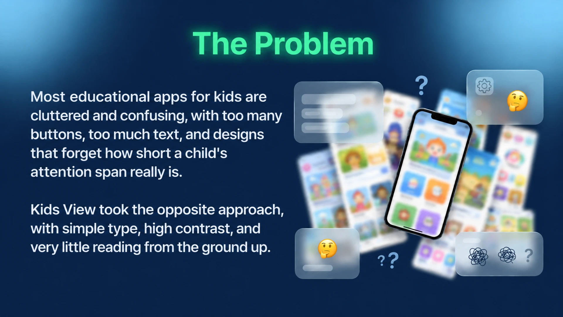
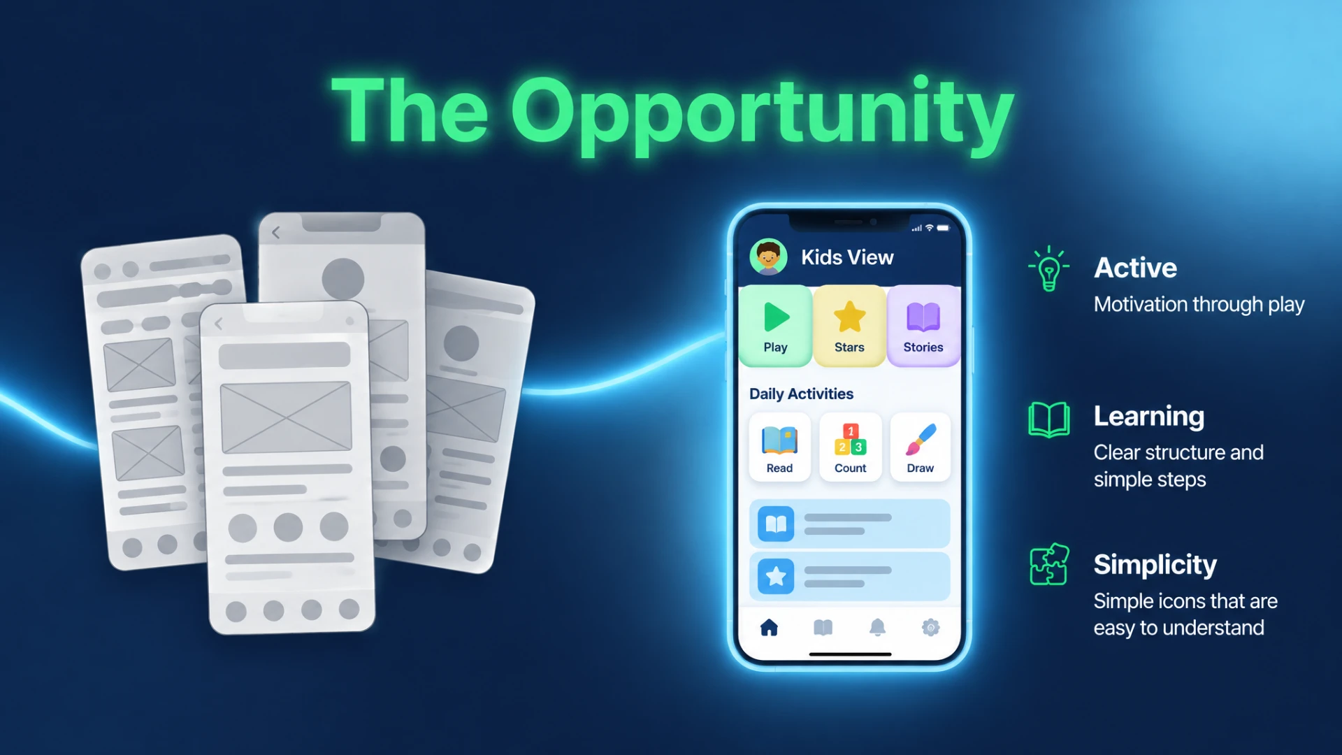
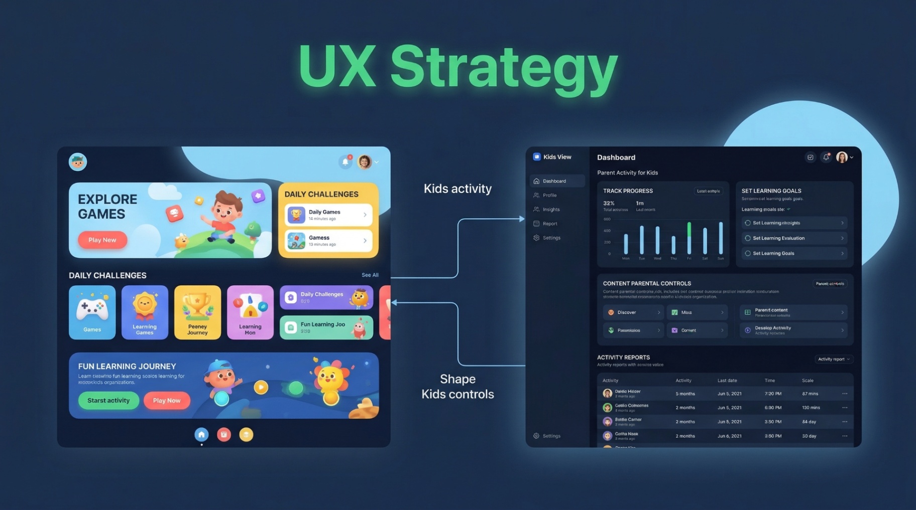
Most kids' apps don't account for how young children actually use a phone. Kids don't use dropdown menus or read long blocks of text. They learn through repetition, big buttons, and sounds that tell them they did something right. Parents are short on time. They want a quick summary of how their child is doing without watching every game.
For Children
Big, easy-to-tap buttons, friendly characters, almost no text, and screens that forgive wrong taps.
For Parents
Clear progress timelines, simple screen time controls, and easy sharing.
From Wireframe to Validated Interface
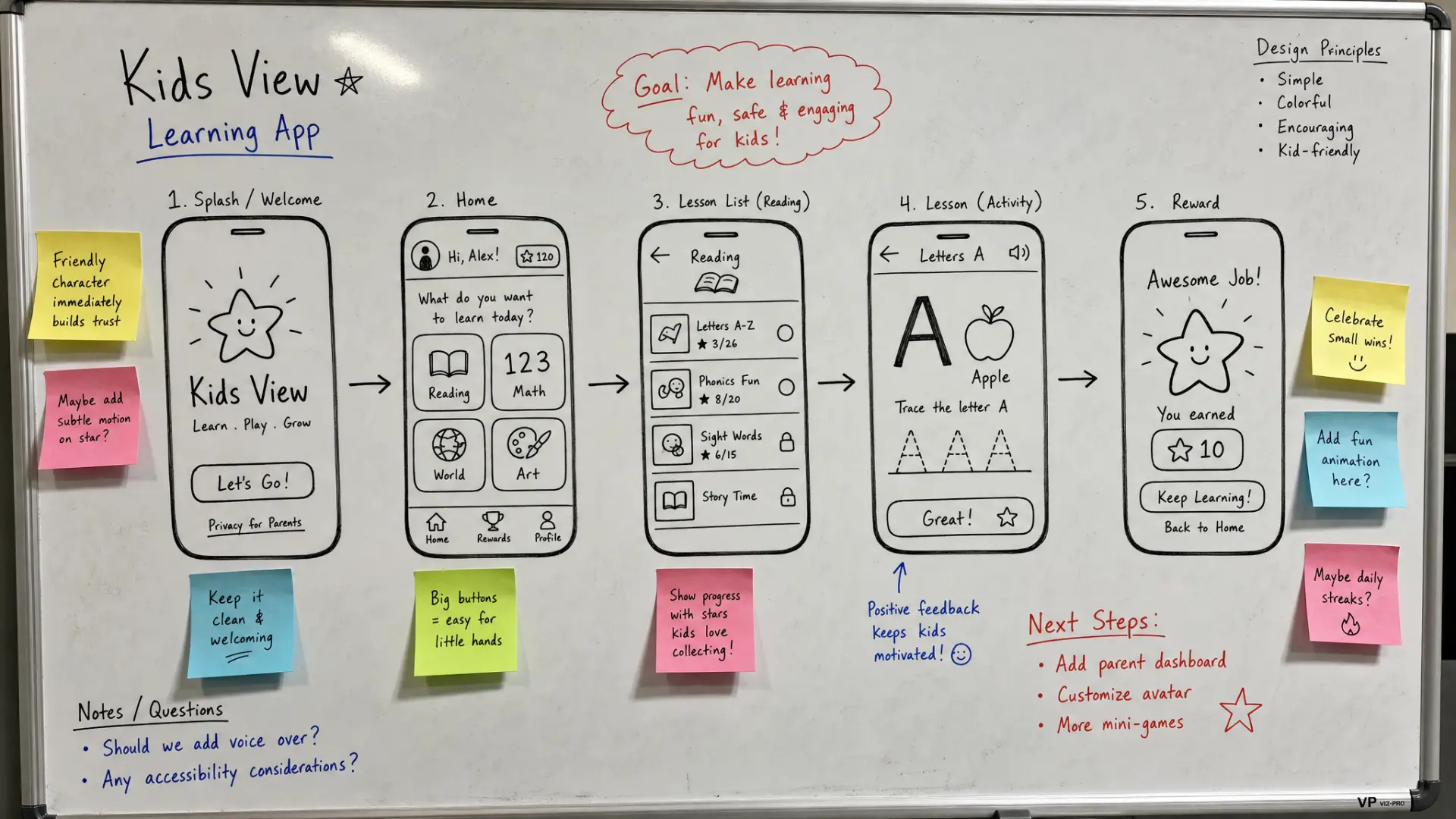
Every screen started as a whiteboard sketch and a low-fidelity wireframe before moving to high-fidelity design. The kids' screens changed the most. Early versions still had too much text. Later versions replaced almost all of it with icons, characters, and color. We then tested the finished design with 12 parents and 15 kids.
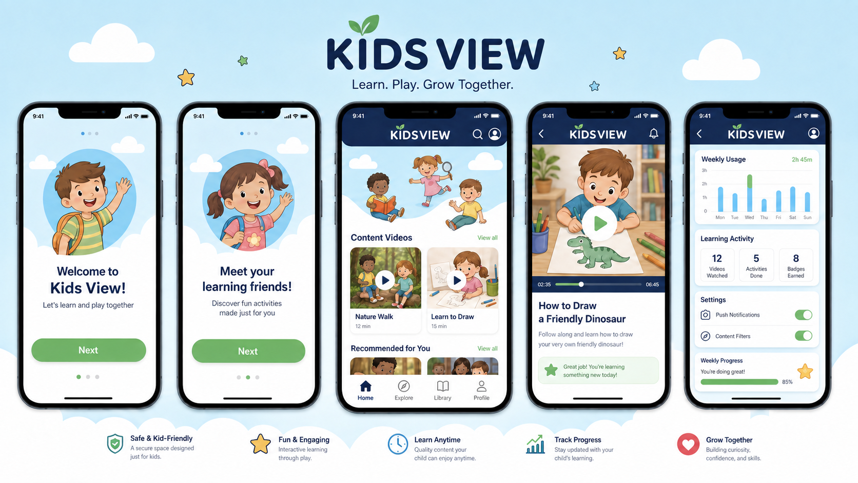
What Kids and Parents Actually Use
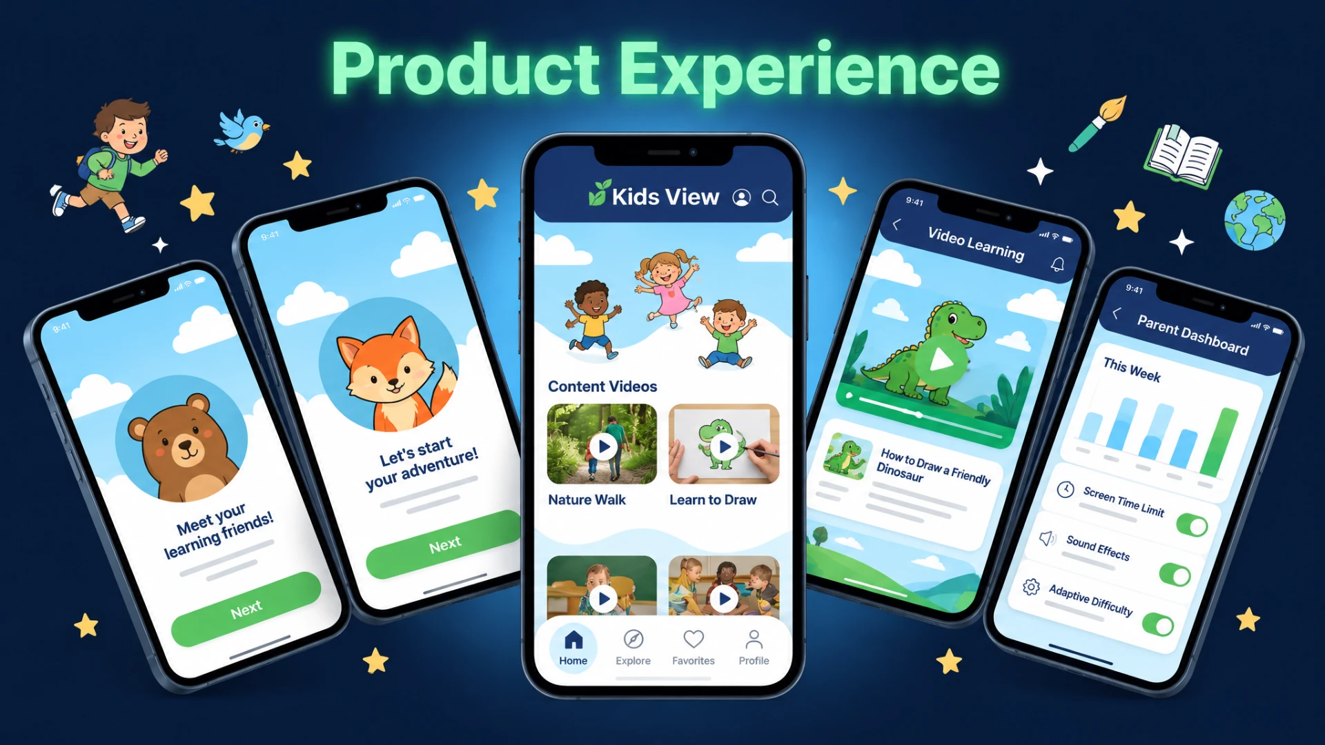
Interactive Learning Path
A game-like learning map that gets harder or easier based on how the child is doing.
The Parent Dashboard
Clear panels showing screen time, progress in each learning area, and what's been shared.
COPPA Guardrails
Parent-only gates, like a quick math question, that keep kids from changing safety settings or billing details.
Key Decisions
Personalized Learning Journeys
Tailoring content to each child's skill level and progress.
Intuitive Parental Controls
Simple setup for screen time limits and parent-only settings.
Data Privacy First Design
Clear data practices and age-appropriate experiences.
Gamified Progress Tracking
Engaging feedback loops to motivate children's learning.
Multilingual Accessibility
Screens and content translated for families who speak different languages.
Cross-Platform Continuity
The same experience on iOS and Android.
Designing Better Play
Designing around how small hands and young minds actually work paid off in testing. Kids got confused far less often, and parents used the progress panels regularly.
94%
Usability Rating
From the 12 parents and 15 kids in the user testing trial.
60%
Higher Self-Sufficiency
Kids got through onboarding on their own more often during the testing trial.
52.4%
Longer Sessions
Increase in average session length during the testing trial.
A Brand Built to Go Beyond the Screen
The Kids View identity was designed to work everywhere: in the app, on printed materials, and in emails. From app icons and stationery to tote bags, apparel, and welcome emails, each concept kept the same friendly, trustworthy voice.
Brand Applications
Everyday Carry
Tote bags and notebooks extending the brand into daily use.
App Identity
Icon variations and mobile brand marks across the product.
Social Templates
Reusable post templates for organic and paid social content.
Apparel and Print
T-shirts, business cards, and printed stationery.
Everyday Objects
Water bottles and other everyday items carrying the brand beyond the screen.
Onboarding Sequence
A welcome email flow introducing new families to Kids View.
Concept design work created for client presentation and stakeholder alignment, not produced or distributed at scale.
The System Behind the Screens
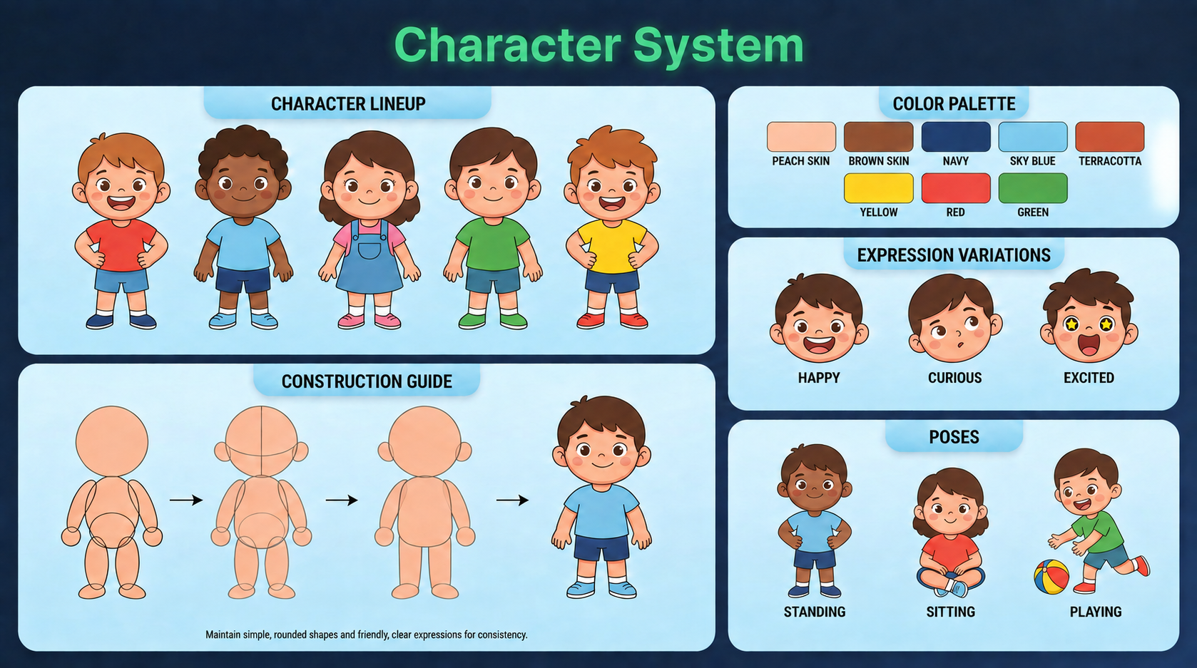
Under the illustrations sits a consistent system of color, type, and reusable components, built so the app could grow beyond a single screen or platform.
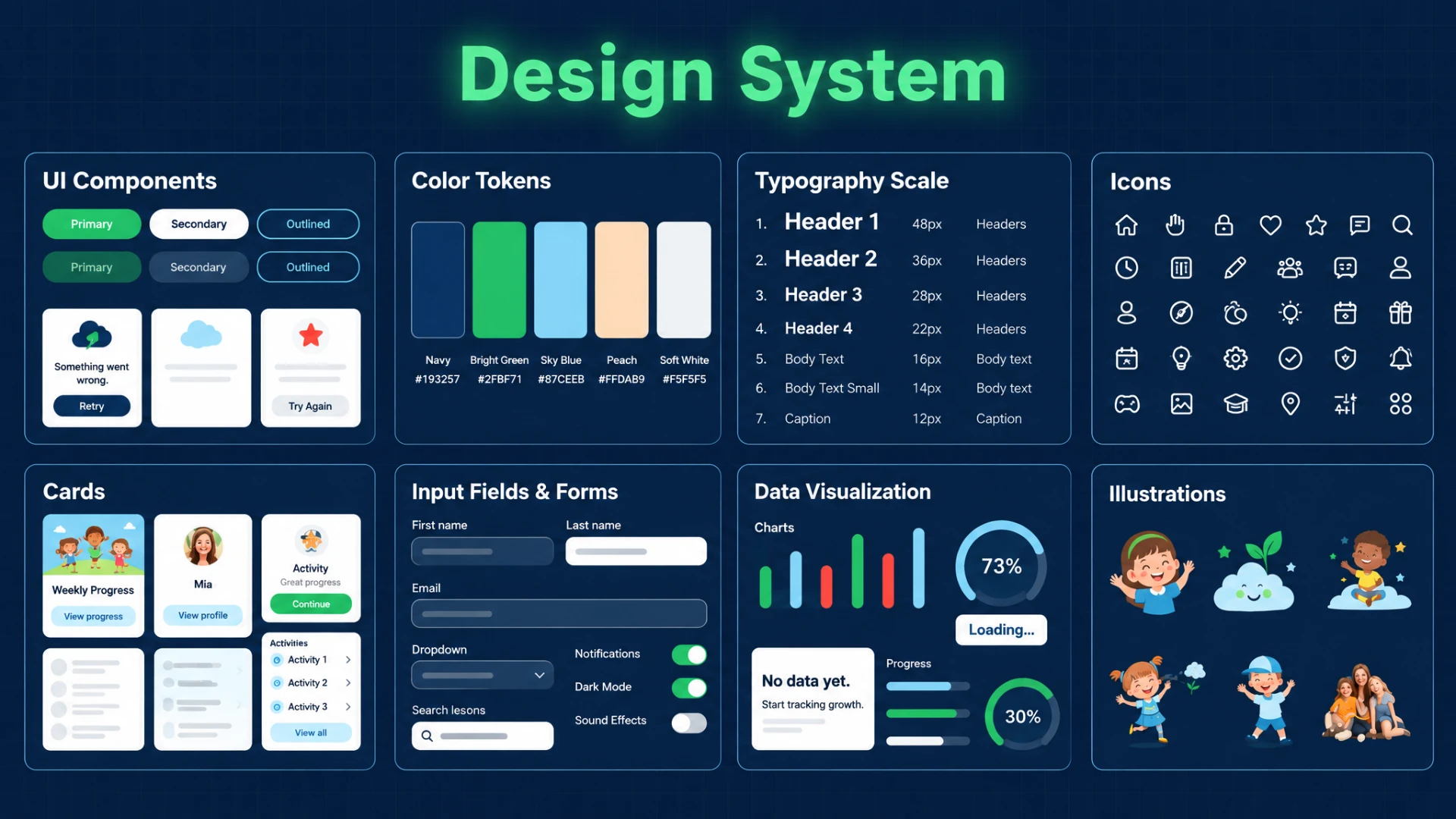
Built for Consistency
Every illustrated character, expression, and pose followed the same construction guide, ensuring a consistent, friendly visual language whether a child was greeted at onboarding or celebrating a finished lesson.
Where This Landed
Kids View completed a full user testing trial with 12 parents and 15 kids. Two of the parents were teachers. The core interaction model held up, usability scores were strong, parents were happy with the dashboard, and kids stayed engaged. Shortly after, the client paused the project because of a shift in their internal priorities, not because of anything in the design or testing. What stuck with me most was the core challenge: building for two completely different ways of thinking, a child's and a parent's, inside one product. I've carried that into every product with more than one audience since.
The testing trial produced strong results: a 52.4% increase in average session length, a 94% usability rating from kids and parents, and 60% higher self-sufficiency in onboarding. Multilingual support was designed in from the start, ready for new markets, though the project ended before that expansion could happen.